The world of interior design is a canvas waiting to be painted with creativity and innovation. One of the most crucial decisions when it comes to creating a captivating interior space is choosing the right colours for your walls. The colours you select can significantly impact the overall ambience, mood, and aesthetics of a room.
In this blog entitled “How to choose the right colour for interior wall painting?”, we'll delve into the intricacies of selecting the perfect colours for your interior wall painting, considering factors such as psychology, lighting, and personal preferences.
Understanding the Psychology of Colour
The psychology of colour is a fascinating and intricate field that delves into how different colours can evoke specific emotions, thoughts, and perceptions in individuals. In the context of interior design and wall painting, understanding the psychological effects of colours is crucial to creating a space that resonates with the desired ambience. Let's explore how various paint colours for home can impact emotions and moods:
Blue
Blue is often associated with calmness, serenity, and tranquillity. It's a colour that can evoke a sense of peace and relaxation, making it an excellent choice for spaces where you want to create a soothing atmosphere. Light shades of blue can mimic the feeling of clear skies and open waters, while darker blues can bring a touch of elegance and depth to a room. Bedrooms, bathrooms, and spaces meant for unwinding can benefit from the calming effects of blue.


Yellow
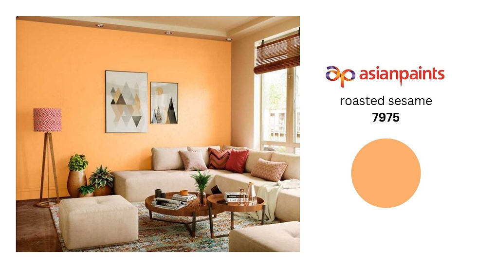
Yellow is the colour of sunshine and positivity. It's known to evoke feelings of happiness, energy, and optimism. When used in interior design, yellow can create a cheerful and vibrant atmosphere. Kitchens, dining rooms, and areas where social interactions take place can benefit from the uplifting nature of yellow. However, it's important to use yellow in moderation, as excessive use can lead to feelings of agitation.


Green
Green is closely associated with nature and the outdoors. It represents growth, balance, and harmony. Using green in interior spaces can create a refreshing and rejuvenating environment. Lighter shades of green can simulate the tranquillity of lush landscapes, while deeper greens can add a sense of sophistication. Incorporating green into living rooms, home offices, or areas where you want to foster a sense of balance can be highly effective.


Red
Red is a bold and intense colour that can stimulate a range of emotions. It's often associated with passion, energy, and excitement. When used strategically, red can create a focal point in a room, drawing attention and adding a touch of drama. However, due to its intensity, red is best used as an accent colour rather than a primary wall colour. It can be incorporated through furniture, decor, or an accent wall to add a dynamic element to spaces like living rooms or dining areas.


Neutral Colours
Neutral colours such as beige, grey, and white offer versatility and timelessness. They provide a neutral backdrop that allows other elements in the room to shine. Neutral colours create a sense of calmness and simplicity, making them popular choices for minimalist or modern interior designs. They also make it easier to change the room's colour scheme over time without needing to repaint the walls.


Understanding the psychology of colour goes beyond simply choosing aesthetically pleasing shades. It involves a deeper exploration of how colours interact with human emotions and behaviour. By aligning your colour choices with the desired emotional impact of a space, you can create an environment that supports your intentions and enhances the overall experience of the room's occupants.
When selecting colours based on psychological effects, it's important to consider the context and purpose of the room. Different spaces serve different functions and evoke distinct emotions. For instance, a bedroom should promote relaxation, while a home office may need to encourage focus and productivity. By tailoring your colour choices to the specific needs of each room, you can harness the power of colour psychology to create a harmonious and meaningful living environment.
Consider Lighting Conditions
Lighting conditions play a significant role in how colours are perceived within an interior space. The interaction between light and colour can drastically alter the way a room looks and feels. As you choose interior house paint colours, it's essential to consider both natural and artificial lighting to ensure that your chosen hues appear as intended. Here's a closer look at how lighting conditions impact colour selection:
Natural Light
Natural light is a dynamic and ever-changing light source that can vary throughout the day due to the sun's position and cloud cover. When selecting colours, consider the orientation of the room and the direction it faces:
North-Facing Rooms: Rooms facing north generally receive cooler and softer light. Colours with warm undertones can help counterbalance the cool light and prevent the room from feeling chilly or sterile. Consider using warm shades of beige, peach, or pale yellows to create a cosy atmosphere.


South-Facing Rooms: South-facing rooms receive ample sunlight, resulting in warmer and more intense light. Cool colours can balance the brightness and prevent the space from feeling overly warm. Shades like light blues, soft greens, and pale greys can complement the abundant natural light.


East-Facing Rooms: Rooms that face east enjoy morning sunlight, which tends to be soft and gentle. Colours with warm undertones can enhance the morning glow and create a welcoming ambience. Light pinks, soft oranges, and warm neutrals can work well in these spaces.


West-Facing Rooms: West-facing rooms are bathed in afternoon sunlight, which can cast warmer tones. Colours with cool undertones can help balance the warmth and prevent the space from feeling too hot. Consider cooler shades of blues, greens, and greys.


Artificial Lighting
The type of artificial lighting you use can influence the appearance of colours. Different light bulbs emit varying tones of light, ranging from warm to cool:
Incandescent Bulbs: Incandescent bulbs emit warm, yellowish light. These bulbs can enhance warm colours like reds, oranges, and yellows. However, they can make cool colours appear duller.


Fluorescent Bulbs: Fluorescent bulbs often produce cooler, bluish light. This type of lighting can make cool colours appear more vibrant, while warm colours might appear less intense.


LED Bulbs: LED bulbs come in a range of colour temperatures, from warm to cool. Some LED bulbs can mimic natural daylight, providing a balanced illumination that maintains colour accuracy. It's recommended to choose LED bulbs with a colour temperature that matches your intended colour scheme.

In essence, lighting conditions can make or break your colour choices. By understanding how natural and artificial light interacts with your selected colours, you can achieve the desired atmosphere and maintain the visual impact you intend for your interior space.
Harmonizing with Existing Elements
Harmonizing the interior house paint colours you choose with existing elements in the room is a crucial aspect of creating a cohesive and visually appealing space. Whether it's furniture, flooring, or decor, all elements should work together to create a harmonious ambience. Here's how to achieve colour harmony through careful consideration of existing elements:
Colour Wheel
The colour wheel is a valuable tool that helps you understand colour relationships and combinations. It consists of primary, secondary, and tertiary colours arranged in a circular pattern. This arrangement highlights complementary, analogous, and triadic colour schemes.

Complementary Colours: These are colours located opposite each other on the colour wheel. Using complementary colours strategically can create dynamic contrast and make both colours appear more vibrant. For example, if you have a green sofa in a room, you could consider painting the walls a complementary shade of reddish-orange to make the green stand out.

Analogous Colours: Analogous colours are adjacent to each other on the colour wheel. This colour scheme creates a sense of harmony and cohesion. For instance, if your furniture features various shades of blue, you could paint the walls in a coordinating shade of blue or a neighbouring colour on the colour wheel.

Undertones
Undertones are subtle hues within a colour that may not be immediately apparent but can significantly impact how colours interact. For instance, a beige with warm undertones may lean toward pink or peach, while one with cool undertones may have hints of grey or green.

When harmonizing colours, consider the undertones of your existing elements. For instance, if your flooring has warm undertones, choosing wall colours with a similar warmth can create a seamless transition between the elements.

Sample and Swatch Testing
Gather paint samples and swatches of your existing elements, such as fabric from furniture, flooring samples, and decor pieces. Hold these samples against potential paint colours to see how they complement or contrast with each other.
Observe how the colours interact under different lighting conditions, as the way colours appear can change based on lighting sources.

Neutral Anchor
If you have colourful and vibrant existing elements, consider using a neutral colour as a backdrop. Neutral colours like beige, grey, and white can balance out a room filled with bold hues and patterns. They provide a clean canvas for your other elements to shine.


Create a Mood Board
Collect images, swatches, and samples of all the elements in the room on a mood board. This visual representation will help you see how colours and textures interact. It will also guide your decisions and ensure a cohesive design.

Consider Proportions
Take into account the proportions of each element in the room. If a particular colour is dominant in your furniture or decor, you might choose a wall colour that complements or balances that dominant colour.

Customization and Adaptation
Sometimes, you might need to adapt your colour choices based on the specific elements you have. Consider reupholstering the furniture or adding accessories to tie the room together if your existing pieces don't perfectly match your desired colour scheme.
Remember that achieving colour harmony doesn't necessarily mean everything has to match perfectly. It's about finding a balance between different colours, textures, and patterns to create an aesthetically pleasing and unified atmosphere. By taking into account the colour wheel, undertones, and sample testing, you can confidently choose wall colours that complement and enhance the existing elements in your interior space.
Personal Preference and Intended Mood
Personal preferences and the intended mood of a room are key factors in choosing the right colours for interior wall painting. Your colour choices should reflect your personality and create an atmosphere that aligns with the purpose of the space. Here's how to consider personal preference and intended mood when selecting paint colours for home:
Reflecting Personal Preferences
Think about your favourite colours and the colours that resonate with you on a personal level. These colours are likely to make you feel comfortable and connected in your living environment. Consider the colours that evoke positive memories or emotions for you. Incorporating these colours can create a sense of happiness and nostalgia within the space.
If you're unsure about your preferences, take a look at your wardrobe, artwork, and even your social media profiles. These can provide insights into the colours you naturally gravitate towards.
Emotional Impact and Mood
Each colour has a unique emotional impact. Consider the mood you want to create in the room:
Calm and Tranquil: Soft blues, greens, and neutral tones can evoke a serene and peaceful atmosphere, making them suitable for bedrooms, bathrooms, or meditation spaces.


Energetic and Vibrant: Bright yellows, oranges, and reds can infuse energy and vibrancy into a room. These colours are great for spaces where social interactions and activities take place, such as living rooms or playrooms.


Sophisticated and Elegant: Deep blues, rich purples, and dark greys can lend an air of sophistication and elegance to a room. These colours work well in formal dining rooms or home offices.


Cosy and Warm: Earthy tones like warm browns and deep reds can create a cosy and welcoming ambience, perfect for living rooms and reading nooks.


Testing and Sampling
Testing and sampling are essential steps in the process of choosing the right colour for interior wall painting. Colours can appear differently on walls than they do on small paint chips or digital screens. By testing paint samples directly on your walls, you can ensure that the chosen colours meet your expectations and harmonize with the room's lighting and existing elements. Here's how to effectively test and sample interior house paint colours:

Gather Paint Samples: Obtain paint samples of the colours you're considering. Most paint stores offer small sample-sized containers that allow you to test the colours on your walls.
Choose a Test Area: Select a relatively large and visible section of the wall to paint the samples. It's best to choose an area that receives both natural and artificial light, as lighting can impact how colours appear.
Prepare the Wall: Ensure that the wall is clean and free of any dirt, dust, or imperfections. If necessary, sand and prime the area before applying the paint samples.
Apply Two Coats: Apply two coats of each paint sample to the test area. Two coats will provide a more accurate representation of the final colour, as the first coat might appear streaky or uneven.
Observe Different Lighting Conditions: Observe how the paint samples look under various lighting conditions. Check them in natural daylight, during different times of the day, and under artificial lighting at night.
Consider Existing Elements: Hold up swatches or samples of your existing furniture, flooring, and decor against the painted samples. This will help you see how the colours interact with the room's elements.
Evaluate Undertones: Pay attention to the undertones of the paint colours. Compare how the undertones of the paint align with the undertones of your existing elements.
Compare and Contrast: Place the paint samples next to each other to compare how they interact. Consider how they work together as a colour scheme.
Give it Time: Colours can look different over time as you get used to them. Leave the paint samples on the wall for a few days to see how you feel about them after some time has passed.
Ask for Feedback: If you're unsure about your choices, ask friends, family members, or even a professional designer for their input. Sometimes, an outside perspective can provide valuable insights.
Adjust if Necessary: If the samples don't match your expectations or don't complement the room as you envisioned, don't hesitate to go back to the drawing board and select new colours.
Purchase Paint: Once you've tested and selected your desired colour, purchase the necessary amount of paint for your project. Make sure to choose the correct finish (e.g., matte, eggshell, satin) based on your preferences and the room's purpose.
Testing and sampling are crucial steps that can prevent disappointment and ensure that you're satisfied with the final result. By physically seeing the paint colours on your walls and assessing how they interact with lighting and existing elements, you can confidently move forward with your interior wall painting project and create a space that reflects your vision and style.
Final Thoughts
Choosing the right colour for interior wall painting is a multi-faceted process that involves considering psychology, lighting, existing elements, personal preferences, and intended mood. By understanding the psychological effects of colours, assessing lighting conditions, harmonizing with existing elements, and being mindful of your desired ambience, you can make an informed decision that transforms your space into a visually appealing and emotionally resonant haven.
Remember, selecting the perfect paint colours for home is not just about aesthetics; it's about creating an environment that reflects your personality and enhances your well-being. So, armed with this comprehensive guide, unleash your creativity and embark on your interior painting journey with confidence.
Comments